Defeat Diabetes
An education-led type 2 diabetes app, reimagined as a personalised, AI-supported companion for its older members
Services
Key outcomes
- Transformed an education-led app into an adaptable daily companion for older, less tech-confident members
- Introduced an in-context AI assistant that eases AI-sceptical members in without intruding
- Improved the meal planner to be adaptable to a member's day and cravings
- Created the Daily Check-in feature, giving members dynamic, circumstance-aware guidance
- Delivered a launch-ready product, user-tested and de-risked, with a roadmap for what comes next
- Readied the product for serious commercial partnerships, with evidence that stands up to a partner's evaluation
About
Defeat Diabetes is a type 2 diabetes self-management app with an established base of mostly older members. In its existing form it worked mainly as an education tool: a twelve-week program of lessons, a library of articles and a well-liked set of recipes, with a meal planner ready to grow into a feature members could rely on.
Supergood Apps led the product design and user testing behind its transformation into a personalised, AI-supported companion, one that meets each member where their day is while staying supportive, accessible and trustworthy for an older, less tech-confident membership.
The challenge
The redesign had to meet two very different sets of expectations at once: those of the members who use the app every day, and those of a commercial partner deciding whether to back it.
Our approach
We ran the work as one engagement spanning product design and the user testing that validated it. The members were already an established base, older adults, many less confident with technology, so we designed from a clear picture of who the app serves, guided by a few plain rules: keep it simple, keep it calm, and make the AI trustworthy.
We created the AI assistant, Dee, new to the product, as a helper built into the app itself, appearing in context across the recommendations, the meal plan and the daily check-in, with the AI engine built by our partner Intervengine.
We then tested the designs with the app's own members, made the refinements it pointed to, and resolved every severe issue before launch. The design was also mapped against the frameworks a partner uses to evaluate a health product.
Defeat Diabetes came away with a product its members stay with, an AI they trust, and the evidence to take to a commercial partner
Members now have an app that adapts to the day they are having and an AI assistant they have reason to trust, the kind of experience that keeps members coming back. Defeat Diabetes came out of the engagement with a validated, launch-ready product it can put in front of a commercial partner.
The members are older adults managing type 2 diabetes, a group that is emotionally vulnerable. Designing for vulnerable people is a core strength of our studio, so their wellbeing shaped every decision here, from the way a weight or HbA1c reading is shown to how transparent the AI is in its recommendations.
The app was already a capable teacher, with a twelve-week program, a library of articles and a well-liked set of recipes. We built on that foundation, adding personalisation across almost every surface and a new AI assistant, Dee, at the centre, so it grew from a strong educational tool into a companion that supports each member through their day.
The app had to work for the members who use it, and earn the backing of a health partner.
Transforming the app meant clearing two bars at once. On one side were the members, older, often less sure with technology, and living with a condition that carries real blame and shame, so the experience had to be genuinely easy and kind. On the other was the bar every health startup meets to grow: to win any serious commercial partnership, a product has to stand up to the scrutiny a large, careful partner brings. We had to do right by vulnerable members and clear the enterprise bar at the same time, without letting either one weaken the other.
For the members using it
- Making the app genuinely easy to navigate for older members who are not always confident with technology.
- Keeping the app non-judgemental and free of pressure, so nothing on screen adds to the emotional load a member already carries.
- Building an AI assistant that members, already sceptical of AI, would actually trust.
- Turning the meal planner into an adaptable tool that responds to a member's day and week, with room to adjust when things change, so no one falls behind.
For winning a partnership
- Handling sensitive health information safely and openly.
- Keeping the AI safe, transparent and easy for a member to question.
- Showing a real evidence base, tested with actual members.
- Being clear about where everyday self-management ends and clinical care begins.
AI built for members wary of AI
A personalisation layer across the entire app, built to read a member's day and to earn trust by staying honest about what it knows.
Dee runs as a personalisation layer across the whole app, shaping the recommendations, the meal plans and the lessons a member sees. As many of these members began sceptical of AI, the brief was as much about conduct as capability: the assistant had to read how a member is doing and return support that feels earned.
The signals it keeps
Personalisation is only as good as what the system understands about a member. We designed Dee's architecture to build from several signals at once: a light cold-start profile at the outset, the validated CAFPAS food-and-cooking behaviour model, the daily check-in inputs of mood, energy and cravings, a member's browsing behaviour in-app as well as with data from connected wearables, including sleep and activity.
The aspiration is a closed loop on self-reported metrics and in-app behaviour, where the app learns what a member reads and cooks and feeds that behaviour back into their profile, so the articles and recipes surfaced to them become steadily more relevant. The entire app experience then becomes more clearly a member's own the longer they use it.
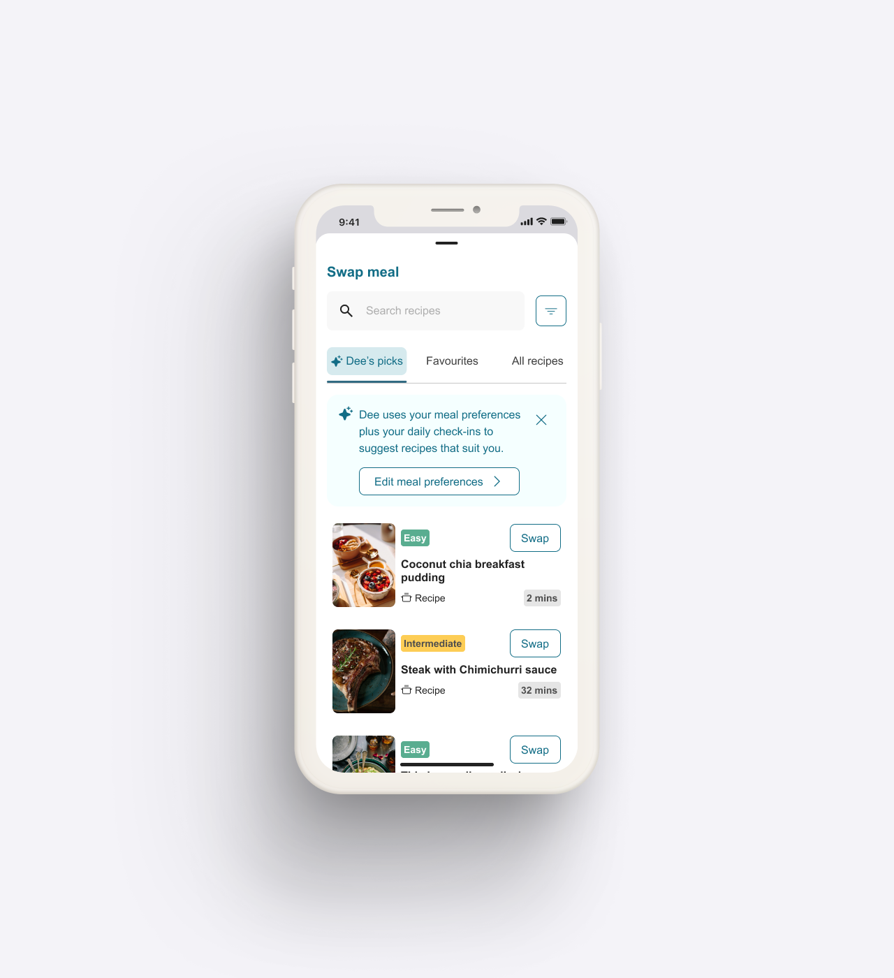
The AI's recipe picks, with a banner clearly listing the signals it draws on to create personalised recommendations for a member.
It also identifies patterns across time and suggests plans for the day and also for longer horizons ahead.
Explanations that stay faithful to the signals
For members wary of AI, a recommendation only helps if they can see why it was made. We attached a plain-language "Why this?" explanation to each suggested item and ordered the reasons by a signal hierarchy that surfaces what a member volunteered ahead of anything the system merely inferred.
Each explanation lists all the signals the AI used to produce that recommendation, so a member can see exactly what it was based on. We treated this as an engineering question before a copy one, identifying that the real constraint was whether the recommender could emit its top contributing signal per item, and worked that through with the team at Intervengine, our AI engine partner.
Where a recommendation touched something sensitive, such as an article on sleep shown to a member reporting tiredness, we worded the explanation as one possible factor, never as a diagnosis.Where a recommendation touched something sensitive, such as an article on sleep shown to a member reporting tiredness, we worded the explanation as one possible factor, never as a diagnosis.
Proven before it was overbuilt
We built realistic, partly simulated AI experiences that members could test before the team committed to full engineering, so we could learn whether people understood, trusted and valued the support first.
To test what a single session cannot, we scoped a longitudinal diary study that evaluates Dee's moments across relevance, trust and explainability over a period of time, with its limits stated plainly: directional findings, a short window, and no claim of statistical generalisability. The study is designed to answer whether the personalisation visibly improves as a member's profile grows.
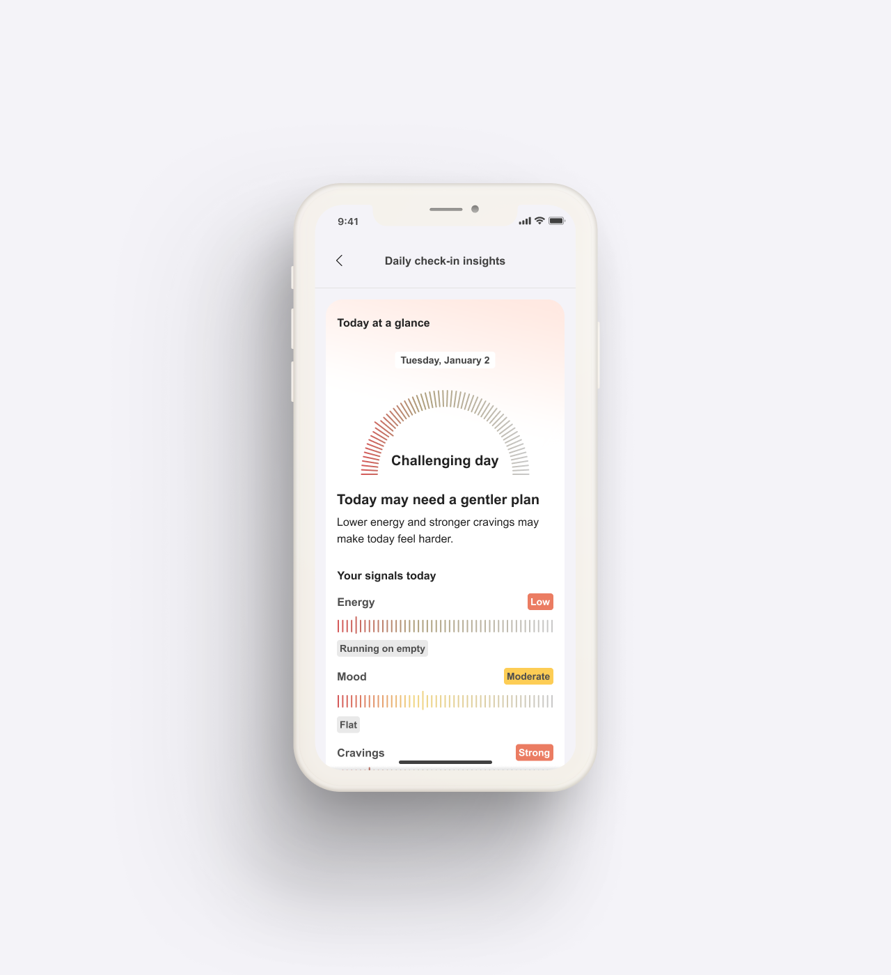
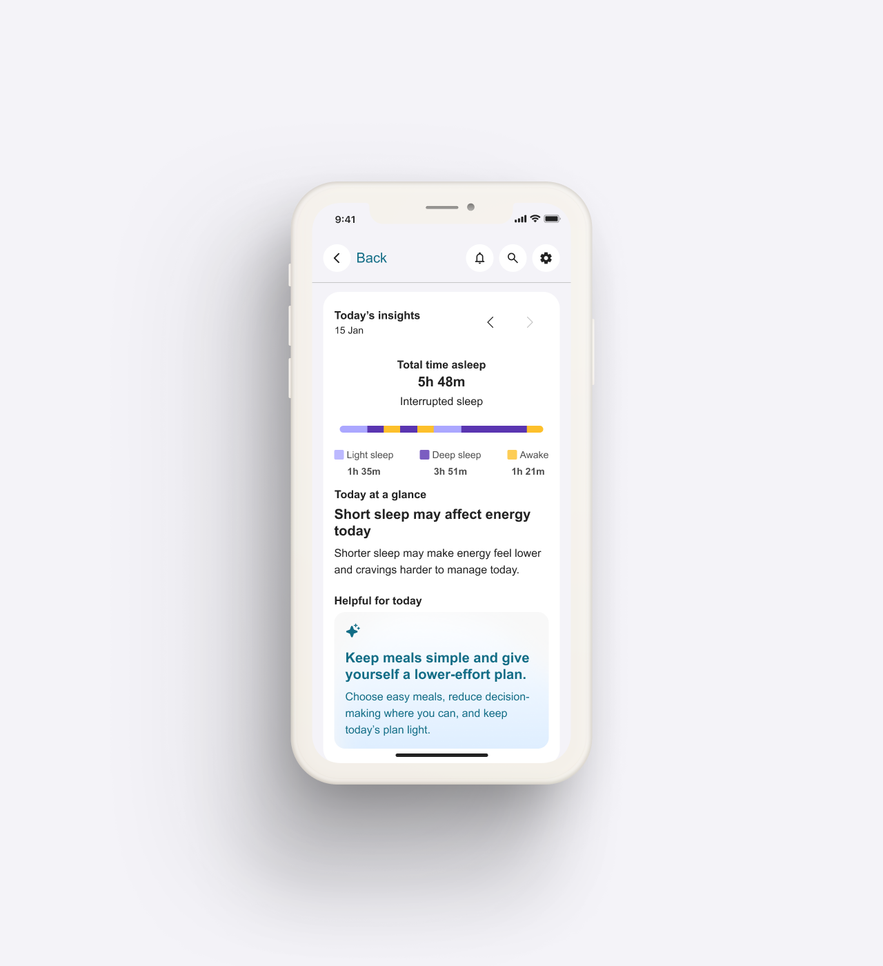
Results from a member's Daily Check-in, and the energy, mood and cravings signals behind it.
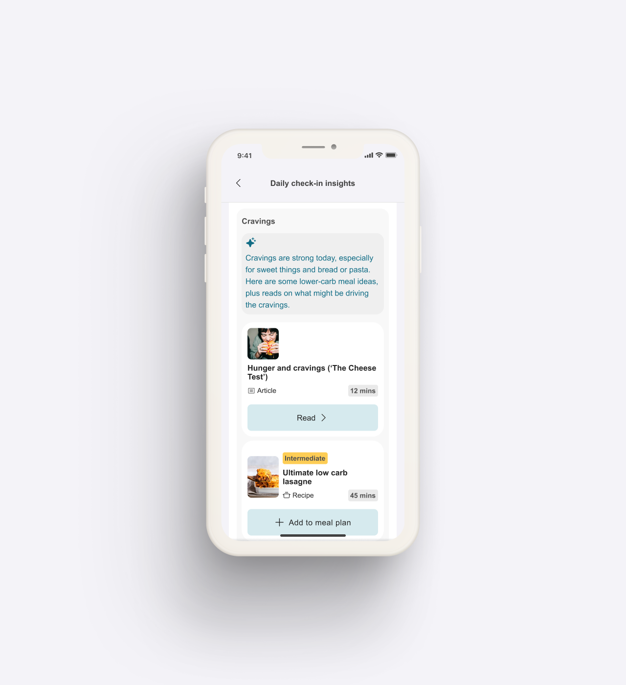
Daily check-in insights: the AI names the signal, then offers a relevant article and/or a recipe.
A daily check-in that shows its value
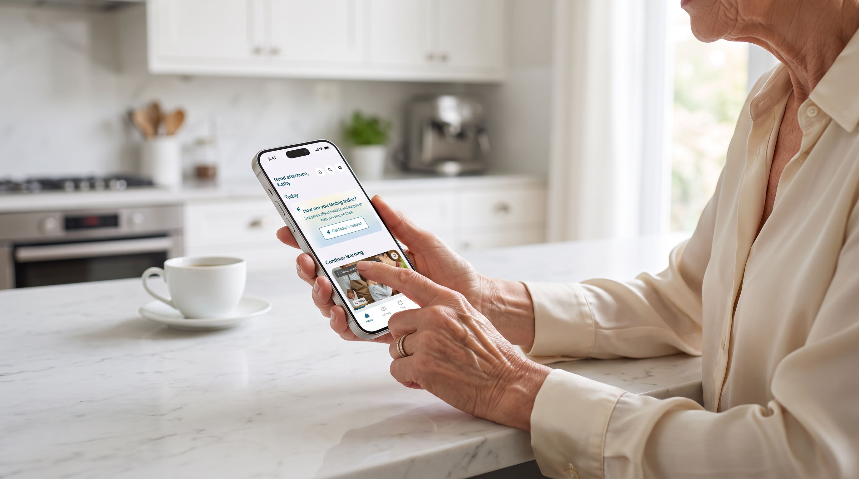
The daily check-in is where a member tells the app how they are doing, and it is also where Dee gathers the signals it personalises from, so we designed it as both a moment of support and the entry point to the whole system.
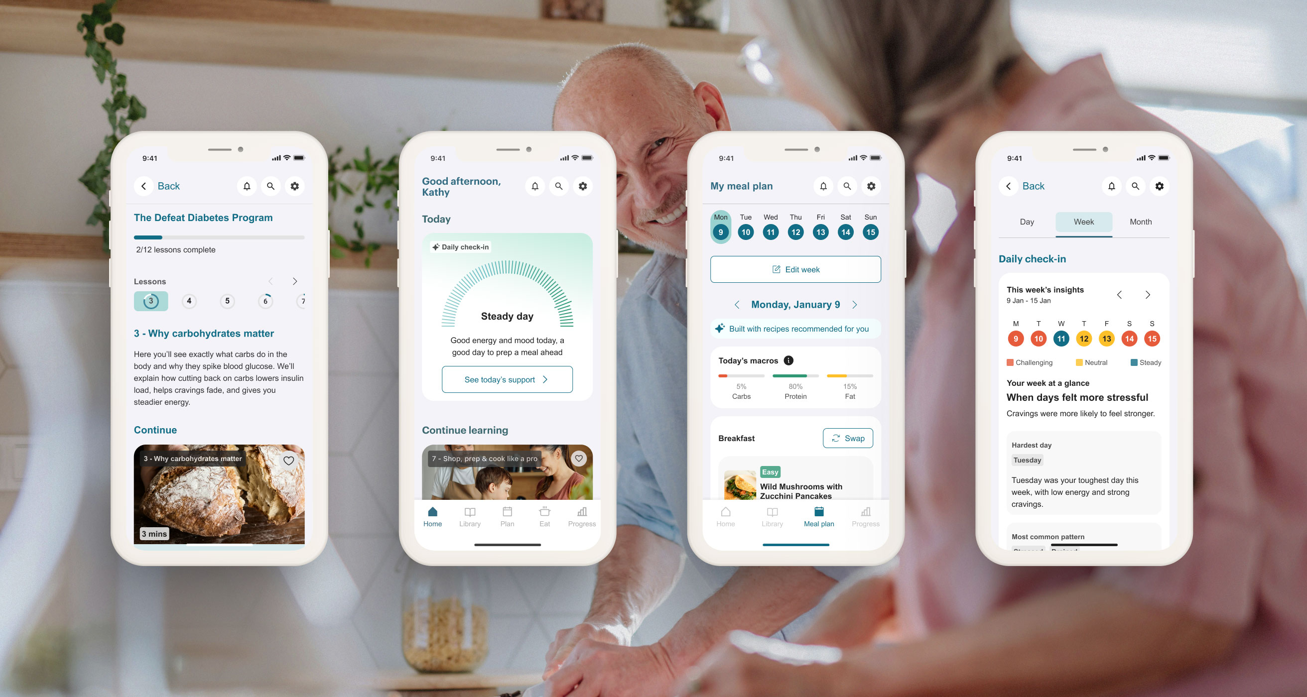
Its questionnaire tested as the part members valued most; the work was to make its purpose unmistakable, so the entry now states plainly what a member gets from it, reading Get today's support. Once a member has checked in, the app resolves the day into one of three states, Challenging, Mixed or Steady, each carried by a soft gauge, an icon and a short descriptive line.
When the suggestions are not quite right, a member can request a fresh set in a single tap or revise their answers so agency always remain with the user. Every change is previewed before it commits and confirmed once it is done.
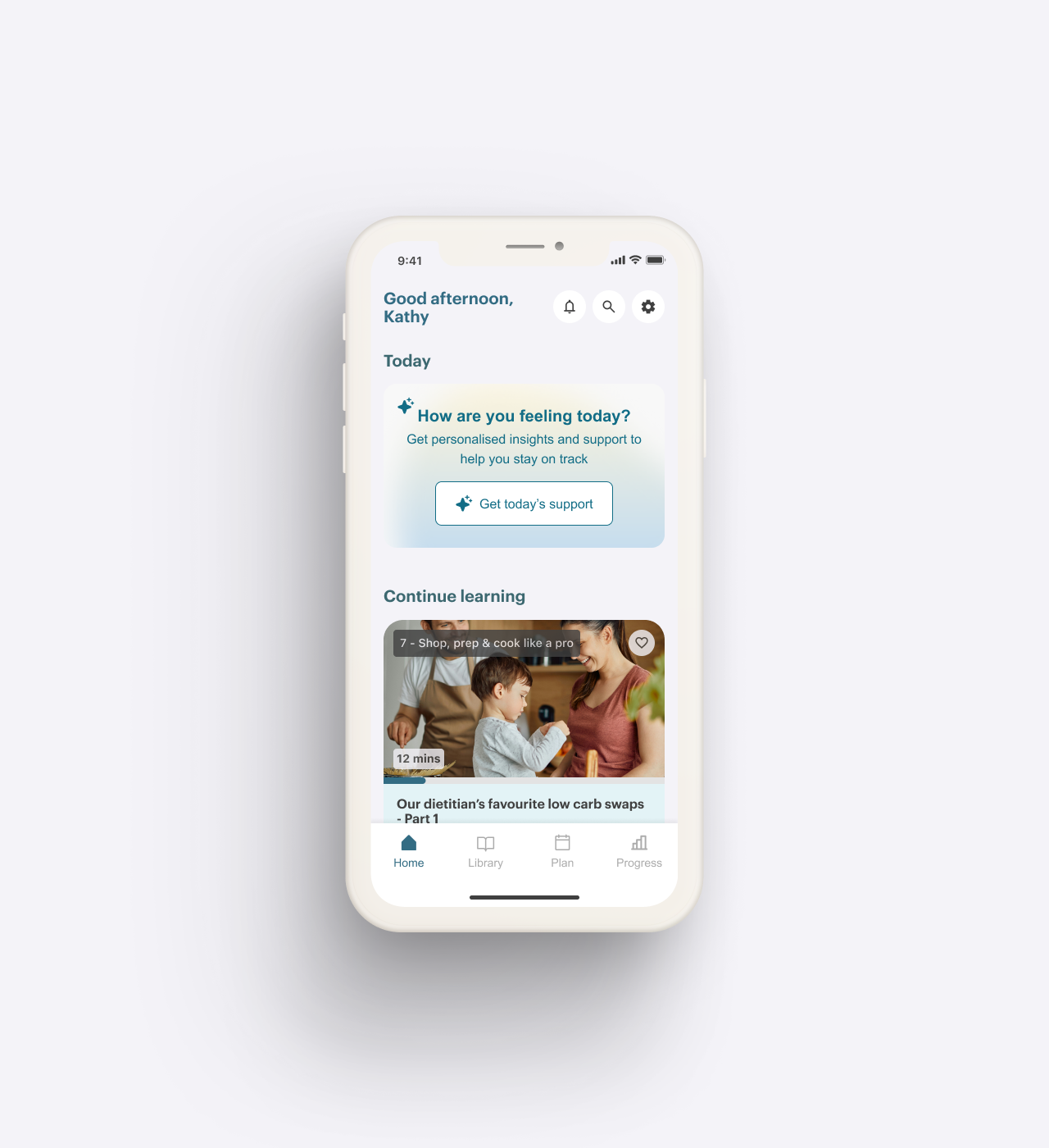
From the Home tab, the entry into the Daily Check-in feature leads with its value to the member, then runs through the questions to a supportive result.
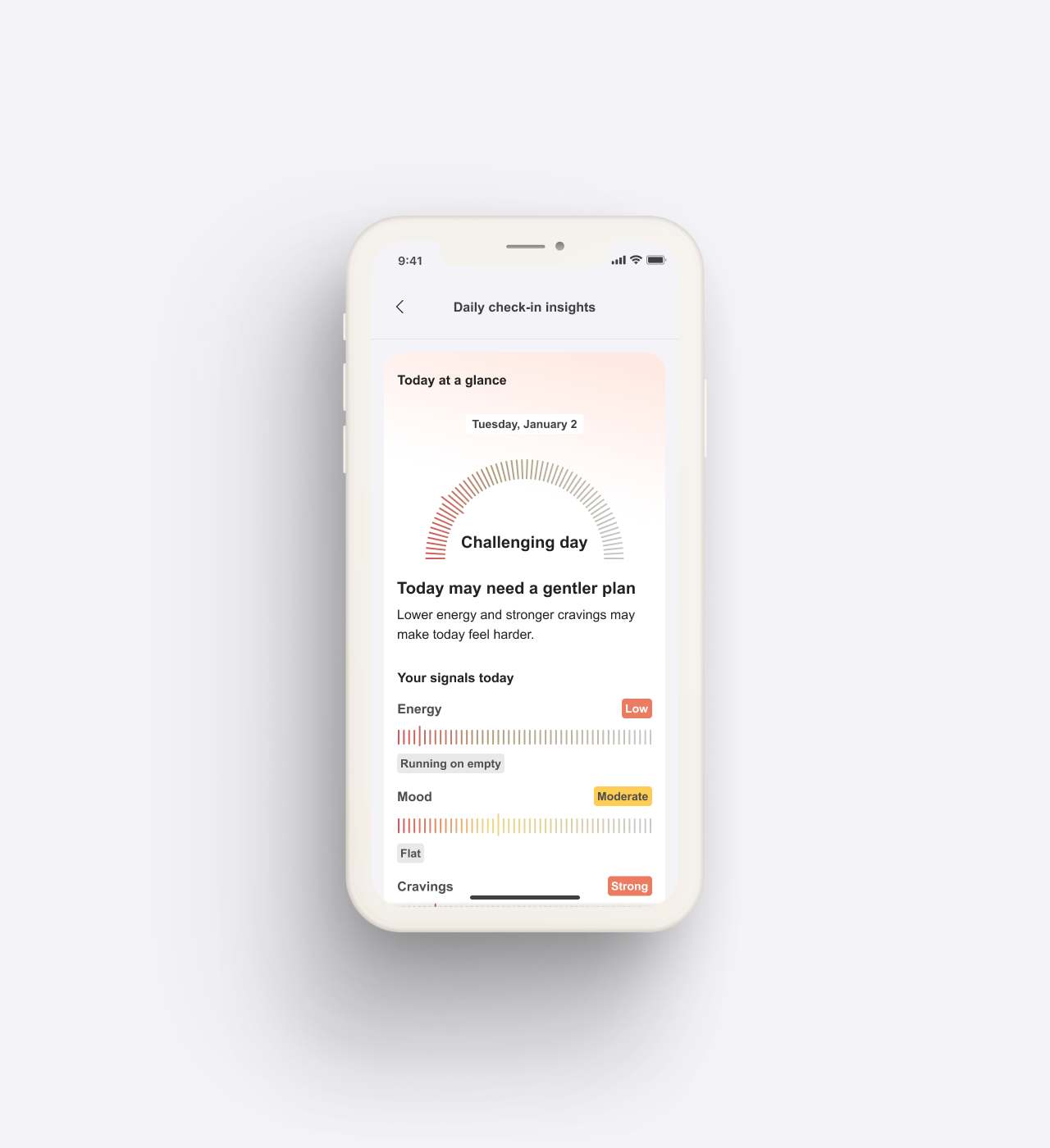
The Daily Check-in results screen shows each recommendation alongside the reasoning behind it.
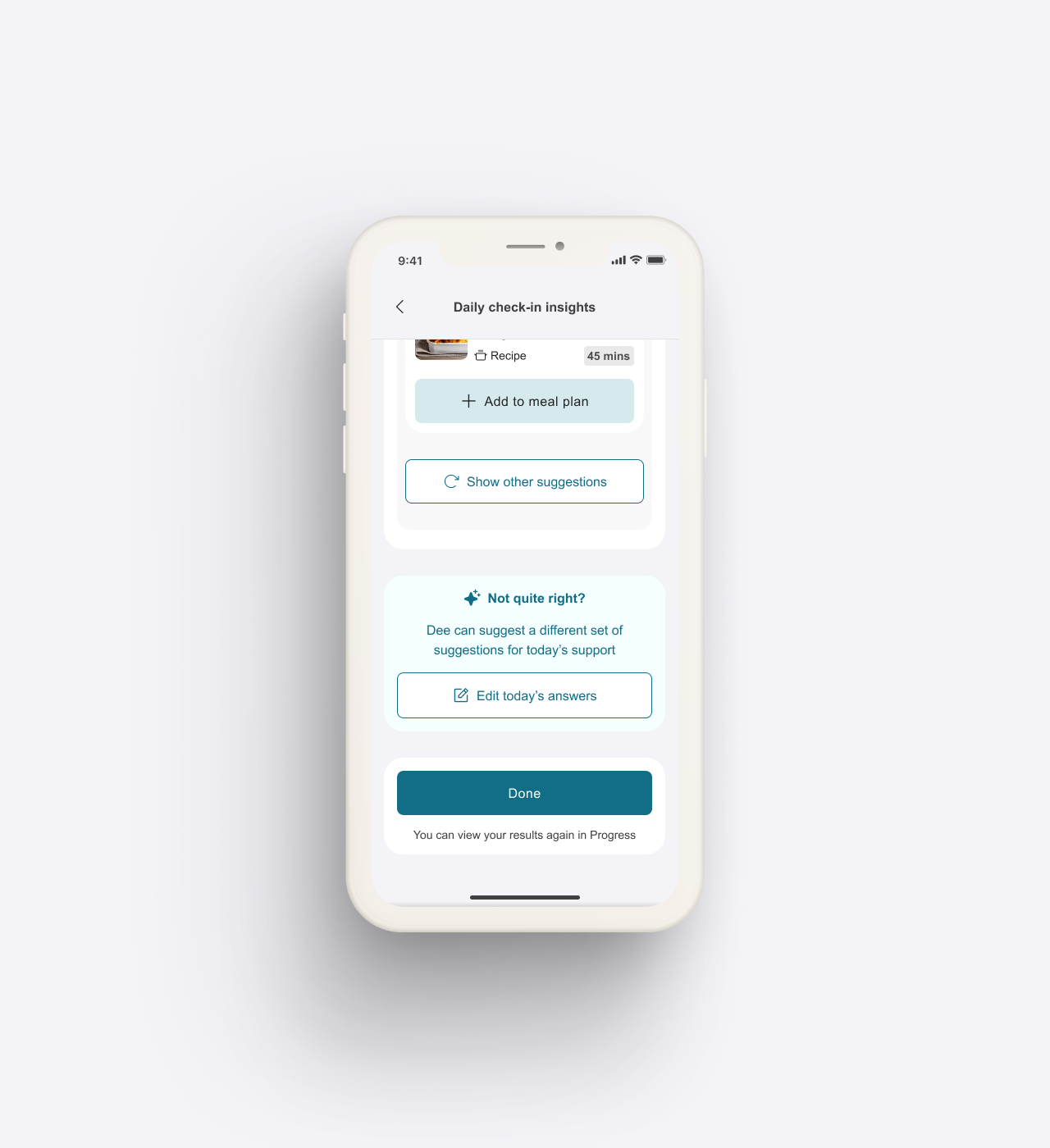
Editing the answers regenerates the recommendations, so a member stays in control.
Personalised meal plans, built to be adaptable
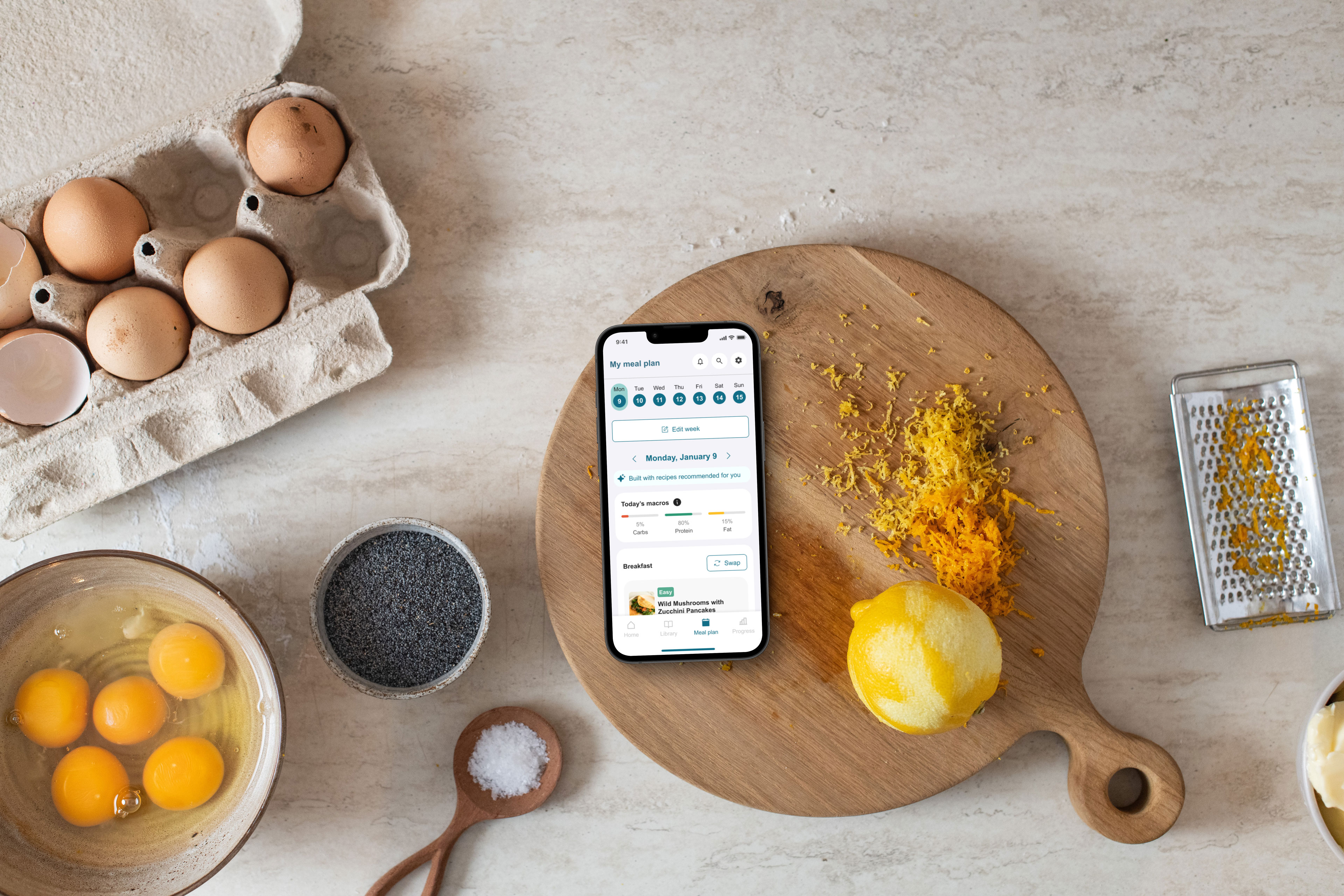
The meal plan is one of the clearest examples of Dee's personalisation. Each weekly plan is generated by the AI from several signals at once: the preferences a member sets during onboarding, the validated CAFPAS food-and-cooking survey they complete when they first browse recipes in the Library, their daily check-ins, and a short preferences quiz that runs each time they generate a plan.
The quiz adjusts to how much the AI already knows. The first run is a fuller cold-start version that captures the stable signals: servings, the cooking and prep time a member can manage, dietary requirements and dislikes. Later weeks run an abridged version that checks mainly what changes week to week, servings and available time, and carries the stable preferences forward, so generating a plan stays quick. A member who would rather not generate at all can start from a balanced everyday plan built by the Defeat Diabetes team, or copy a previous week.
The plan draws on both static and dynamic signals, so it holds a member's lasting preferences while still responding to how they feel at any point in the day and to the cravings they report. The plan is also built to adapt after it is made. Swapping a meal or moving to another day takes a single, obvious action, and a gentle dinner reminder offers a few quick recipes on the evenings a member has not yet added dinner to their plan.
Managing a chronic condition leaves people emotionally vulnerable, and a food app can easily add to that, so we designed to protect against it. There is no running calorie countdown, for example, because for these members that kind of prompt is linked to guilt and rigid thinking.
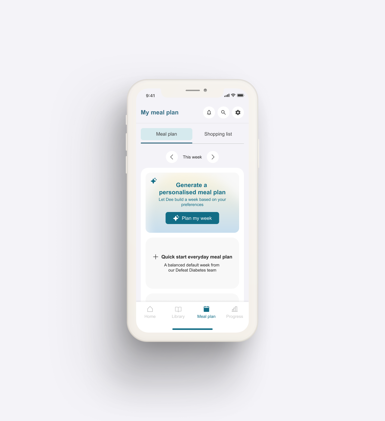
The generate-a-plan flow guided by AI, from the plan tab through the preferences quiz to the finished weekly plan.
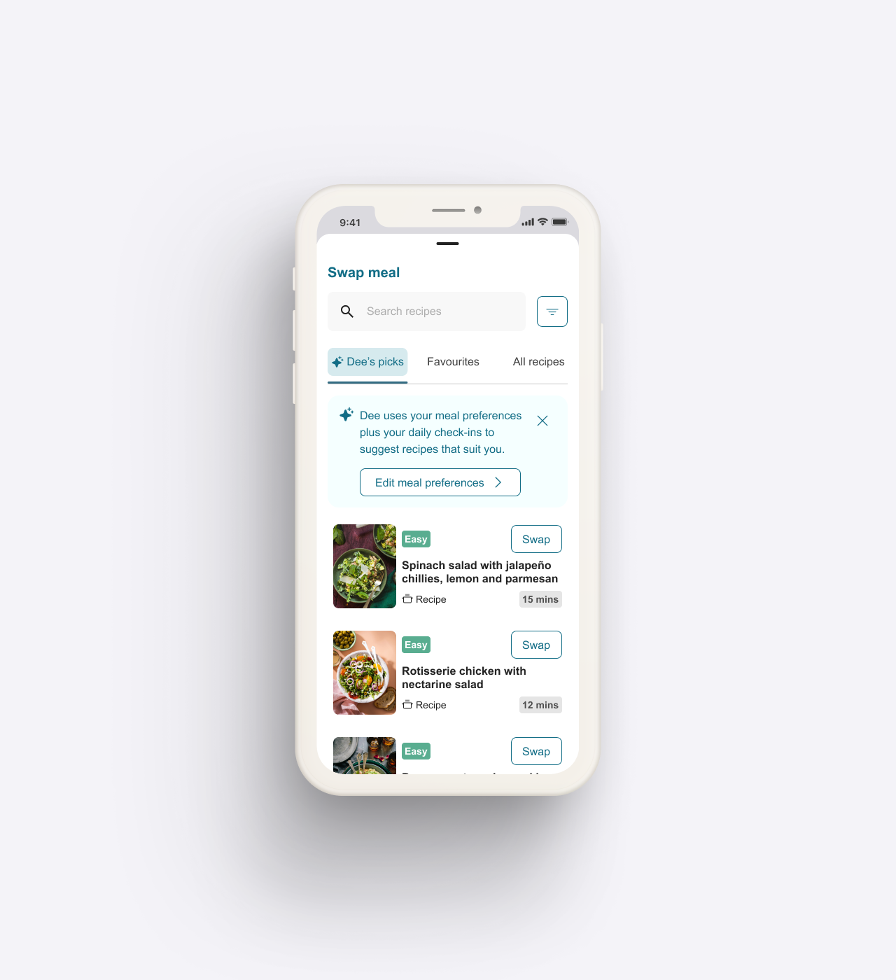
Choosing a replacement recipe for a meal in the plan.
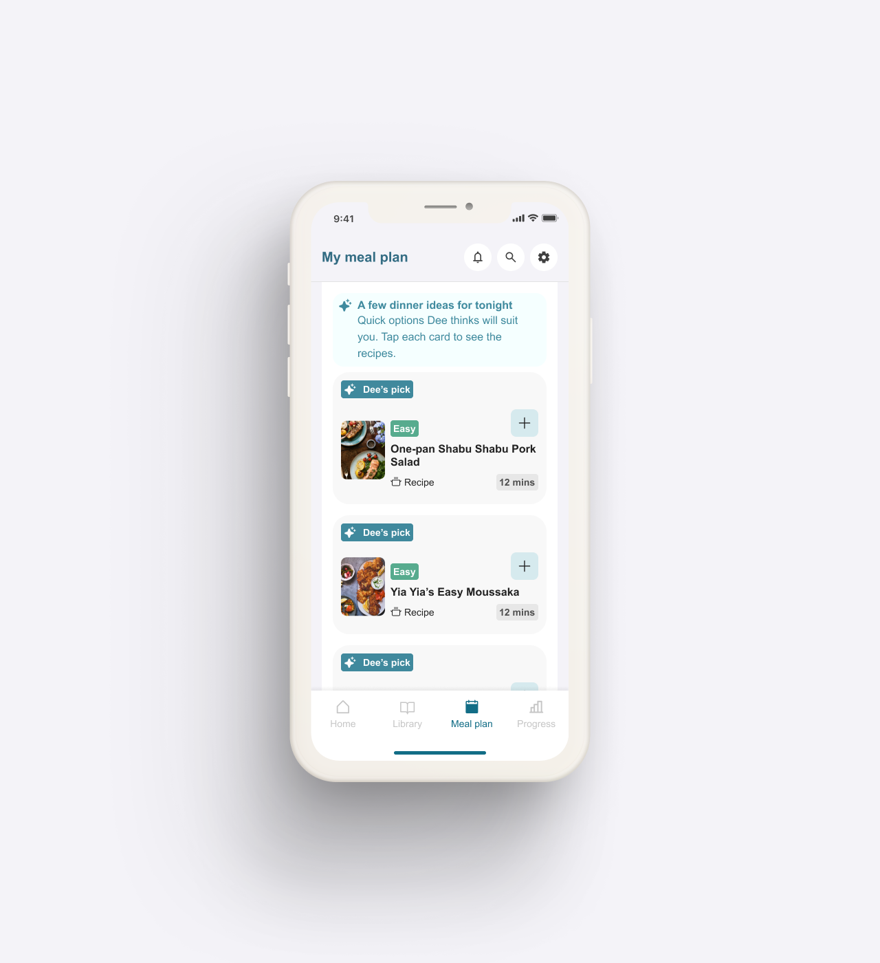
The dinner reminder deep link, opening straight to a few quick recipes to add.
Foundations for a dynamic learning experience
A structured but explorable program, with check-ins and quizzes that keep the learning active.
We designed the learning program to teach clearly, and to lay the foundations for something more dynamic. The program runs across twelve lessons, and each lesson lays out its sections clearly, with the original clinical content kept intact, so the program keeps a firm spine a member can follow.
Within that framework, contextual links let a member explore horizontally, the way one article on Wikipedia leads to a related one. The journey has a clear structure while staying open to a member's own curiosity, so learning can be self-directed without anyone losing their place.
The learning is active. A short quiz tests a key idea and responds to the answer, confirming what a member gets right and, when they miss, surfacing the key idea plainly with an invitation to try again.
Checking understanding as a member goes keeps them engaged and helps the teaching stick.
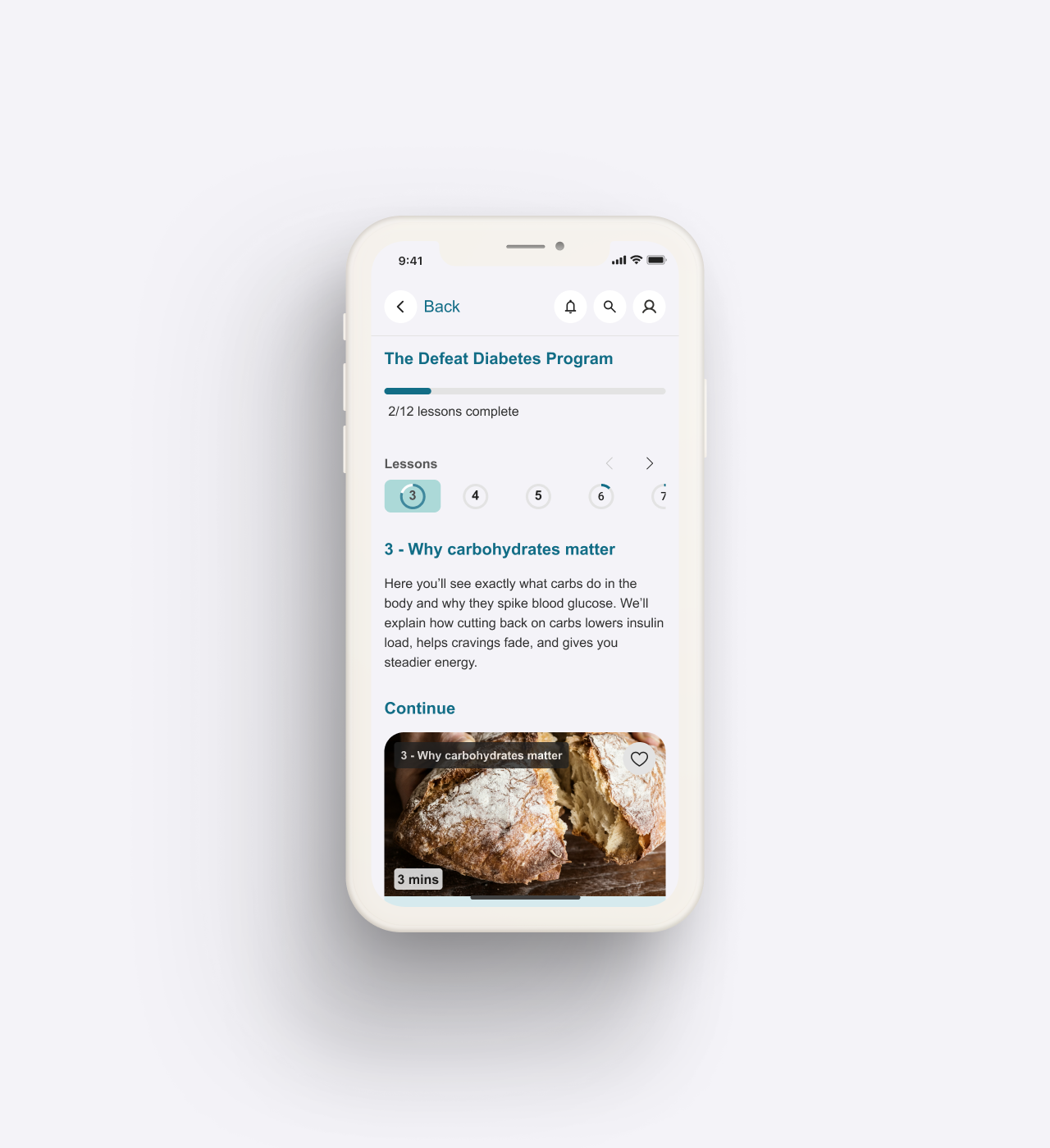
The program overview, moving between weeks and into a lesson with its modules and supplementary reading.
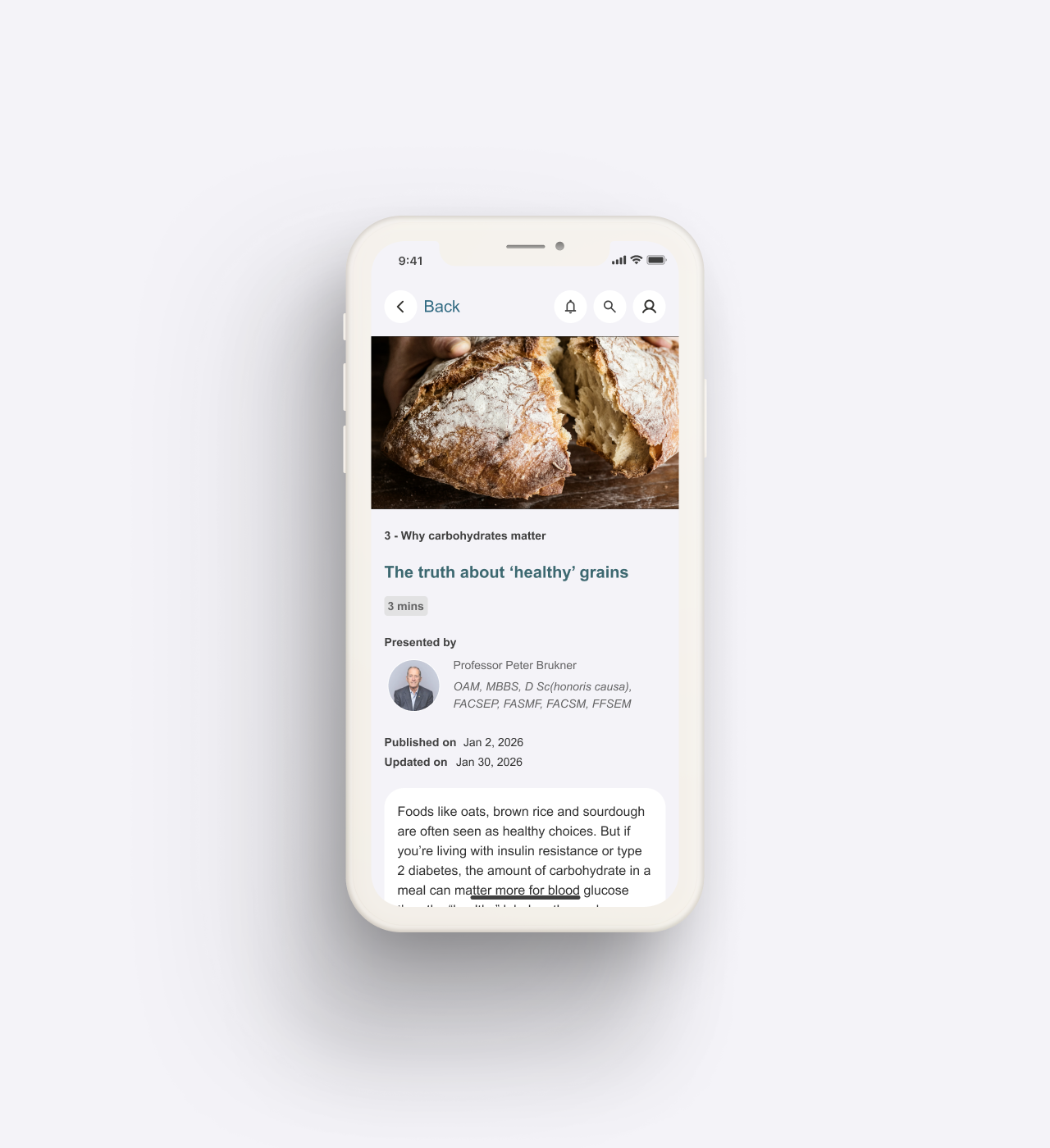
Deep links in a lesson carry a member into a related piece of content, without losing their place
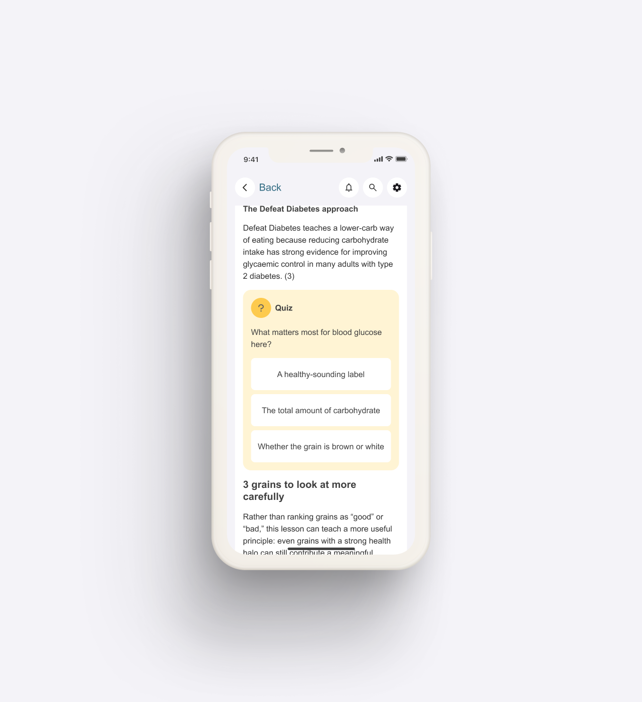
The in-lesson quiz responds to each answer, and surfaces the key idea plainly when a member misses.
Health data made easy to understand
The Progress tab is where a member sees how they are tracking over time. Readings, graphs and statistics can be hard to make sense of, so we designed them to be legible for an older, less tech-confident membership, with each metric labelled in plain language and its trend easy to read at a glance.
Sensitive readings like weight and HbA1c are shown as plain facts, never as a good or bad score, because for members living with a condition that already carries blame, a graded number can reinforce guilt and rigid thinking. The design gives a member the information they need to act, and leaves any clinical interpretation to their care team.
Progress also brings a member's signals together over time: the check-ins they log across mood, energy and cravings, and the sleep, activity and cycle data from their connected wearables. Each signal opens to its own trend, so single days become a picture of a member's patterns. Seeing those patterns helps a member understand what tends to make a day harder or easier, and it is the picture the AI draws on to suggest a plan suited to the days ahead.
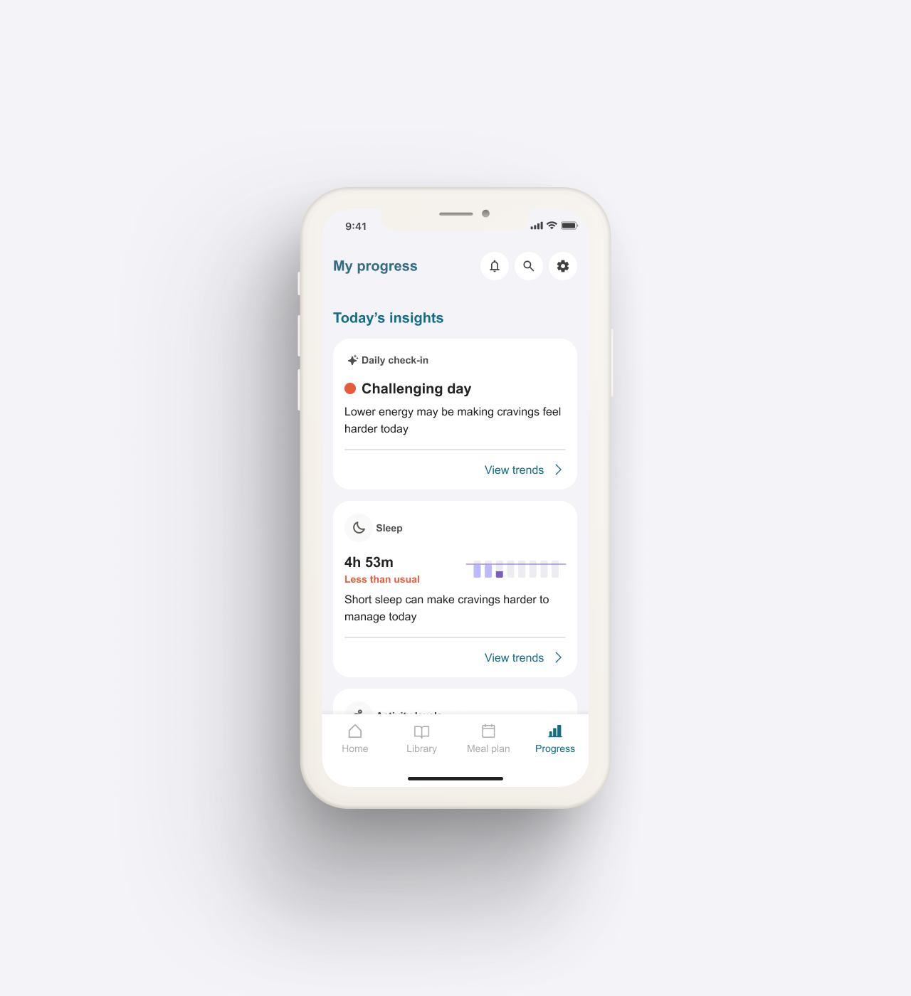
Today's insights and trends over time, check-ins alongside sleep, activity and cycle from connected wearables.
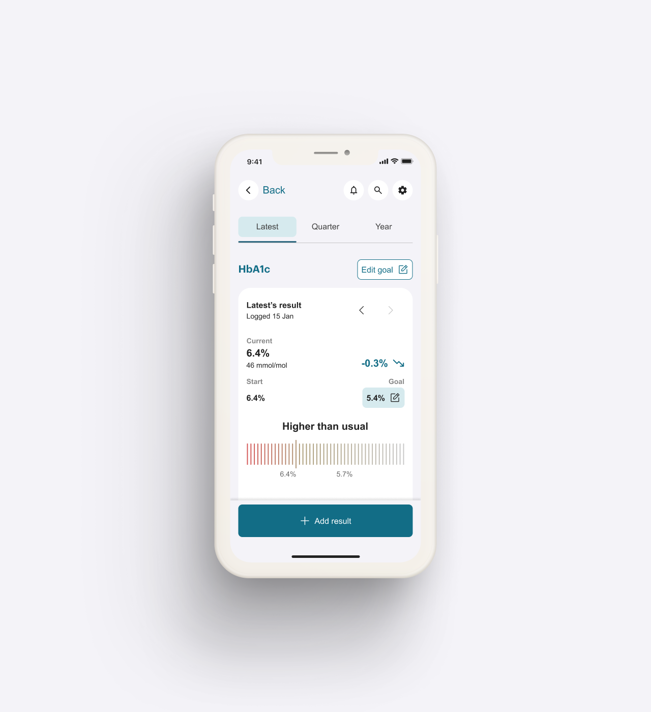
Health readings over time, like HbA1c shown as plain facts across different time periods.
Every design decision was made and validated with user research
Every design decision above traces back to a verified finding or a cited principle, and we ran the user testing to a standard a clinical assessor would expect.
Triangulated across methods and audiences
We ran three methods, moderated sessions, unmoderated tests and tree testing, and accepted a finding only when its results converged across them. We tested with both existing members and new users, so the conclusions held for continuity and for a first-time experience alike.
Held to an evidence standard
We ran the sessions so that older, less-confident members were comfortable taking part, and we analysed the results by recognised methods: every observation coded through reflexive thematic analysis, and every issue classified against established usability heuristics. Findings and best-practice recommendations were kept clearly labelled, so every claim traces to what a member actually did or to a cited principle. The work produced a clear, prioritised set of actions the team could build from.
Mapping the design to evaluation frameworks partners use*
A partner or an evaluator weighing whether to back a health product has to be sure it is safe, credible and worth putting their name behind, so they look at a handful of things: whether it is safe and clear that it supports self-management without diagnosing or treating, how it protects sensitive health data, whether the people it serves can actually use it, whether any AI in it is safe and can be questioned or overruled by a member, and whether there is real evidence behind its claims. Recognised frameworks exist for exactly this, among them the NICE Evidence Standards Framework for digital health, the TGA's boundary for software-based medical devices, and Australia's Voluntary AI Safety Standard.
We designed the product to meet those frameworks as part of the redesign, so it already satisfies much of what partners would typically ask. The same things that make it trustworthy for its members, an AI that explains itself, a supportive and non-judgemental experience, and design decisions grounded in real user evidence, are what these frameworks measure.
NICE Evidence Standards Framework
We validated the redesign with real users who were older adults managing type 2 diabetes. Sensitive numbers like weight and HbA1c are shown as plain facts, never as a good or bad score, which helps reduce the bias and stigma that framing can carry. Where the app uses quieter signals for its recommendation, like what a member has browsed, it reports it and escalates any specific treatment decision to a clinician.
TGA boundary for software-based medical devices
Self-management and behavioural-change software that offers no specific treatment suggestion sits outside the regulated device boundary. The assistant guides, personalises and explains, and it stops short of a specific treatment recommendation, which keeps the design on the self-management side of that line. The determination is the client's and the TGA's to make.
The National AI Centre's Guidance for AI Adoption
The AI work maps directly onto this guidance and its six essential practices. Members are told an AI is shaping what they see, and the "Why this?" explanations make its reasoning clear and honest, which meets the practice of sharing essential information. A member can ask for a fresh set or adjust the inputs and say why, which keeps a person in control of the system. The scoped diary study is the ongoing testing and monitoring the guidance asks for.
*Clinical effectiveness, regulatory classification, privacy compliance and security certification sit outside our design work. We provide the design and the evidence behind it, and the final call on each of those belongs to the client and the relevant authority.